Classic Usage Conventions
As you work on the Classic system you will see common elements on the screens, each of these are described below:
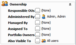
Folding panel |
|
|
Information is held in folding panels which allow you to hide or show information as required. Click on the icon to expand or collapse this panel. For example, here we see the Ownership folding panel with an appropriate icon. Clicking on the icon and heading or on the double arrows will hide the Ownership panel. |
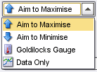
Drop-down list |
|
|
This function is used throughout Covalent to allow the user to select an option from a number of alternatives. You view the list of alternatives by clicking the downward arrow on the right of the drop-down box. Select the option by clicking on it in the displayed list. |
Multi-selection list |
|
|
Some lists will allow you to select more than one option at a time, for example if you want to highlight a number of items to delete from a list. You may use the following selection options: Hold down the Ctrl key on the keyboard; this allows you to choose non-sequential items from a list by clicking on each one. Hold down the shift key on the keyboard; this allows you to select a sequential group of items. Click on the first item, hold down the shift key and click on the last item; all the items in between are selected. |
Radio button |
|
|
A radio button is used when the user must select an either/or option (the circle with a dot in the centre is the selected option). |
Dots-in-the-box |
|
|
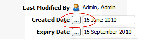
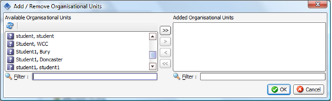
The dots-in-the-box button This can be to: 1.Enter free text in a text box. 2.Select a date from a calendar. 3.Select available options in the Add/Remove dialogue box. 4.Choose from a pop-up dialogue box. |
1. Text box |
Throughout the system, notes or comments can be added or removed by clicking on the dots-in-the-box, for example adding a status update to an Action or a Risk. Clicking on the dots-in-the-box button opens a text window.
Click the OK button to save and close the text box. |
2. Calendar |
Throughout the system, dates can be added by clicking on the dots-in-the-box, for example entering an Action's due date. Clicking on the dots-in-the-box button opens a calendar.
You may alternatively type the date into the date field. |
3. Add/Remove Dialogue Box |
Lists may have items added or removed by clicking on the dots-in-the-box, for example the list of people that have access to an item. Clicking on the dots-in-the-box button opens a dialogue box similar to that displayed below. The available options are listed on the left and the items already added on the right.
Select an item from the list on the left. Click the single arrow button. The item moves to the list on the right. Click OK. Removing items from the right side list is a reversal of this process. The double arrows will add/remove everything in the list. |
4. Pop-up Dialogue Box |
You may sometimes need to choose an option from a pop-up dialogue box, for example if you are selecting a field to go on a report, or picking which chart to show on a PI. Each pop-up will be different depending on the action being performed. |
 is used to add further information.
 Watch it!
•View the tutorial: Usage Conventions |
Need more information..?
|